Project Overview
Time Link is a Zimbabwe-based company offering professional services across multiple industries. The client approached this project with a clear goal: modernise their digital presence while retaining brand recognition.
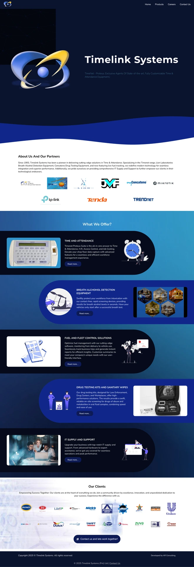
The existing website was outdated in both visual design and usability, which did not reflect the company’s growth or professionalism. This project focused on creating a modern, clean, and trustworthy experience through updated UI design, colour strategy, and a refreshed logo.
My Role
UX Designer / UI Designer
I was responsible for:
- Developing a modern color scheme aligned with the brand’s values
- Refreshing the existing logo using modern colors
- Redesigning the website UI to feel contemporary and professional
- Improving overall visual consistency and usability
The Goal
- Modernize the visual identity
- Improve clarity and hierarchy across pages
- Create a consistent and scalable color system
- Maintain brand recognition while refreshing the logo
- Enhance user confidence and trust
The Process
1. Brand & Visual Audit
I reviewed the old website to identify:
Weak colour contrast
Inconsistent branding
Opportunities to simplify layouts
This audit helped define what needed to change while keeping what still worked.
2. Colour Scheme Development
The original colour palette felt outdated and lacked visual harmony. I introduced a new modern colour scheme that:
Uses cleaner, more contemporary tones
Improves contrast and accessibility
Feels professional and trustworthy
The updated palette became the foundation for the entire redesign, ensuring consistency across all pages.
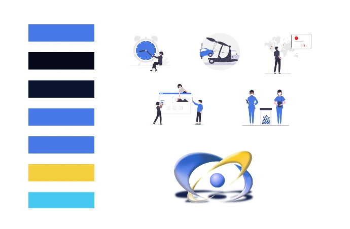
3. Logo Refresh
Rather than redesigning the logo from scratch, I refreshed it by:
Applying the new modern colour palette
Improving visual balance
Making it more adaptable for digital use
This approach preserved brand recognition while aligning the logo with the updated visual identity.

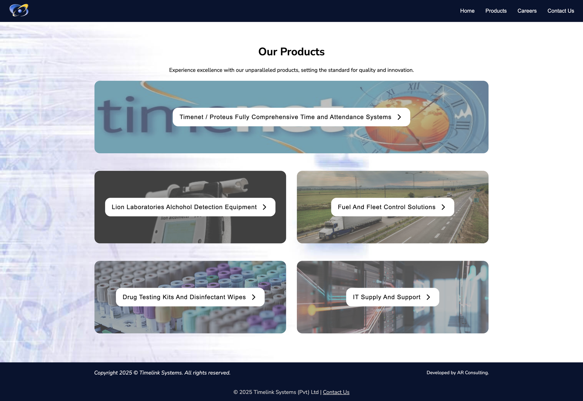
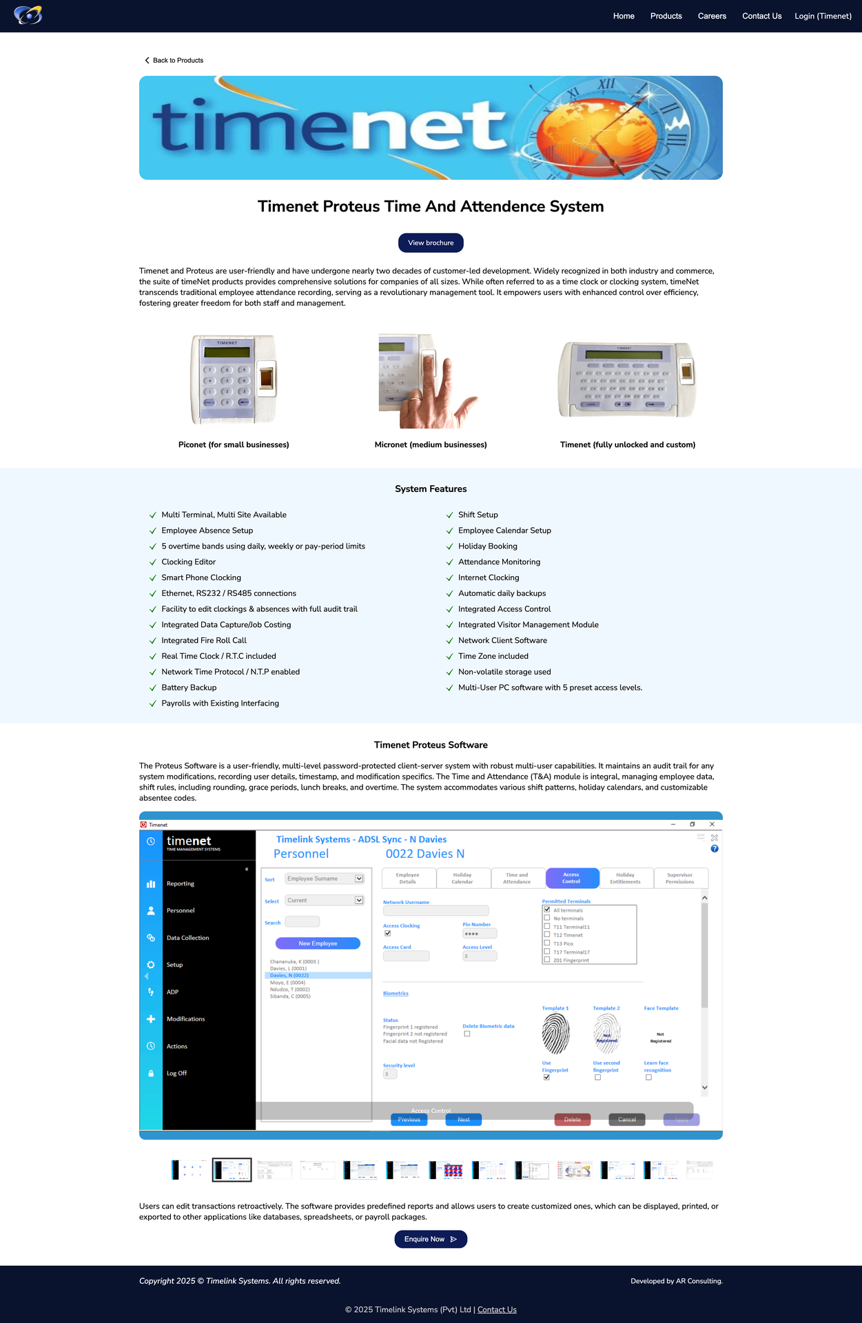
4. UI Redesign
With the new colours and branding in place, I redesigned the website interface to:
Use cleaner layouts and spacing
Improve typography hierarchy
Create a more intuitive and modern user experience
The result is a website that feels lighter, clearer, and more aligned with current design standards.