Introduction
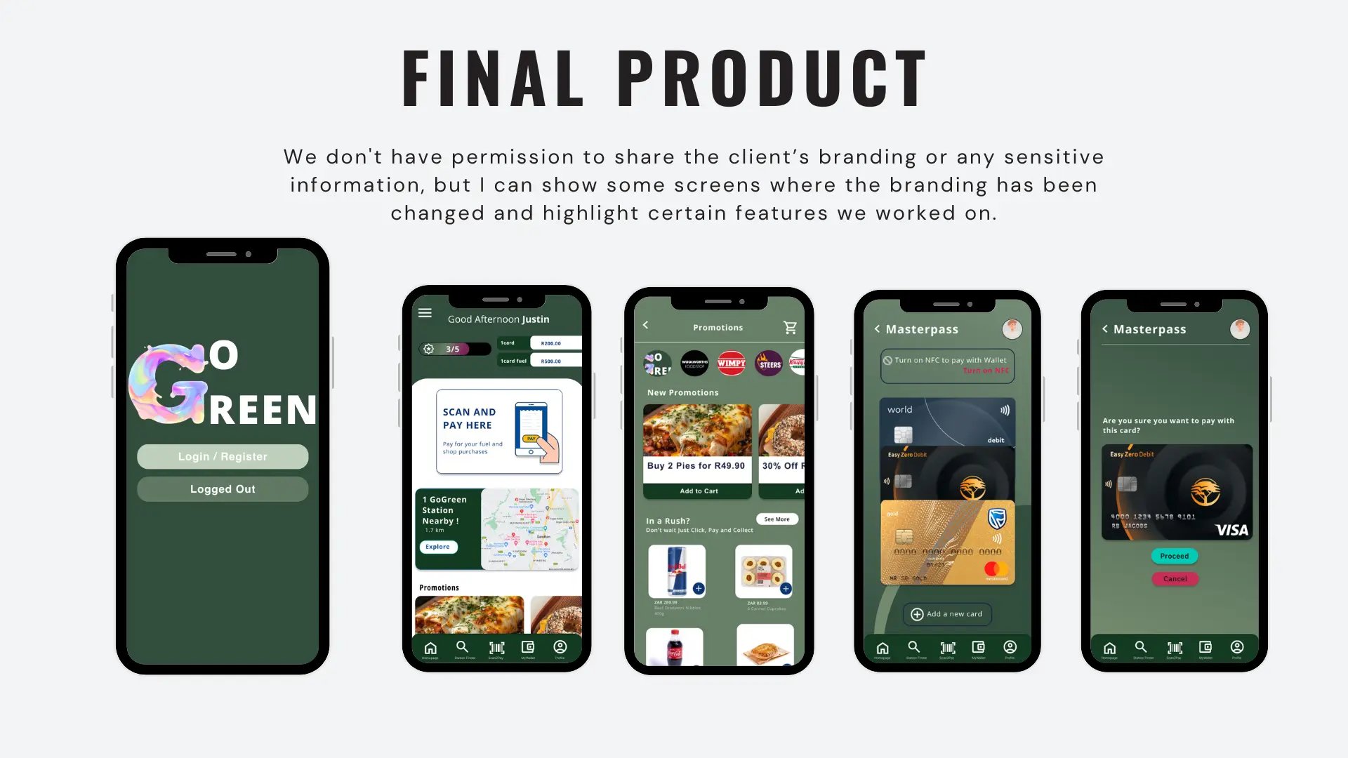
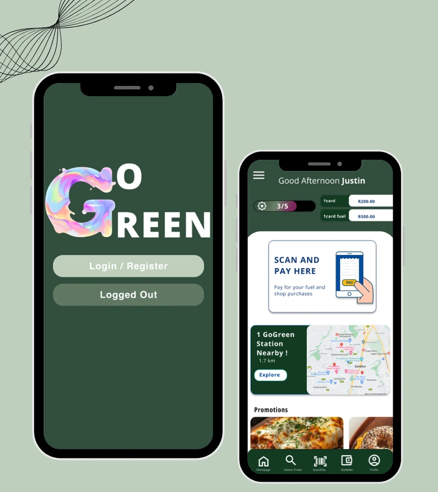
Go Green project was from a client from a large fuel copany to deesgin their exisitng application to attra t more users. Their current app had only a few features and suffered from various navigation issues in its UX/UI design. The client aimed to increase user engagement with their app.
Context & Timeline
Role: UX/UI Designer & Interaction Designer
Timeline: July 2024
Objectives:
- Redesign their existing UI
- Enhance the current features in the app
- Incorporate new features that would entice users to use the app
- Fix navigation issues and make overall navigation easier for users
- Integrate fleet management and employee accounts into the app
- Incorporate a B2B angle
Research
For the first phase, the focus of the project was research — gaining a solid understanding of the company and the more intricate details, such as:
Stakeholder mapping
Scope
History of the company
Business goals
Objectives
System architecture
Payment integration
Success factors
Business requirements
In conducting research for this project, we carried out interviews and surveys that helped us build a well-rounded understanding of what users were looking for in the application. This research guided us in identifying opportunities to create new features and improve the current flow and functionality of the app.
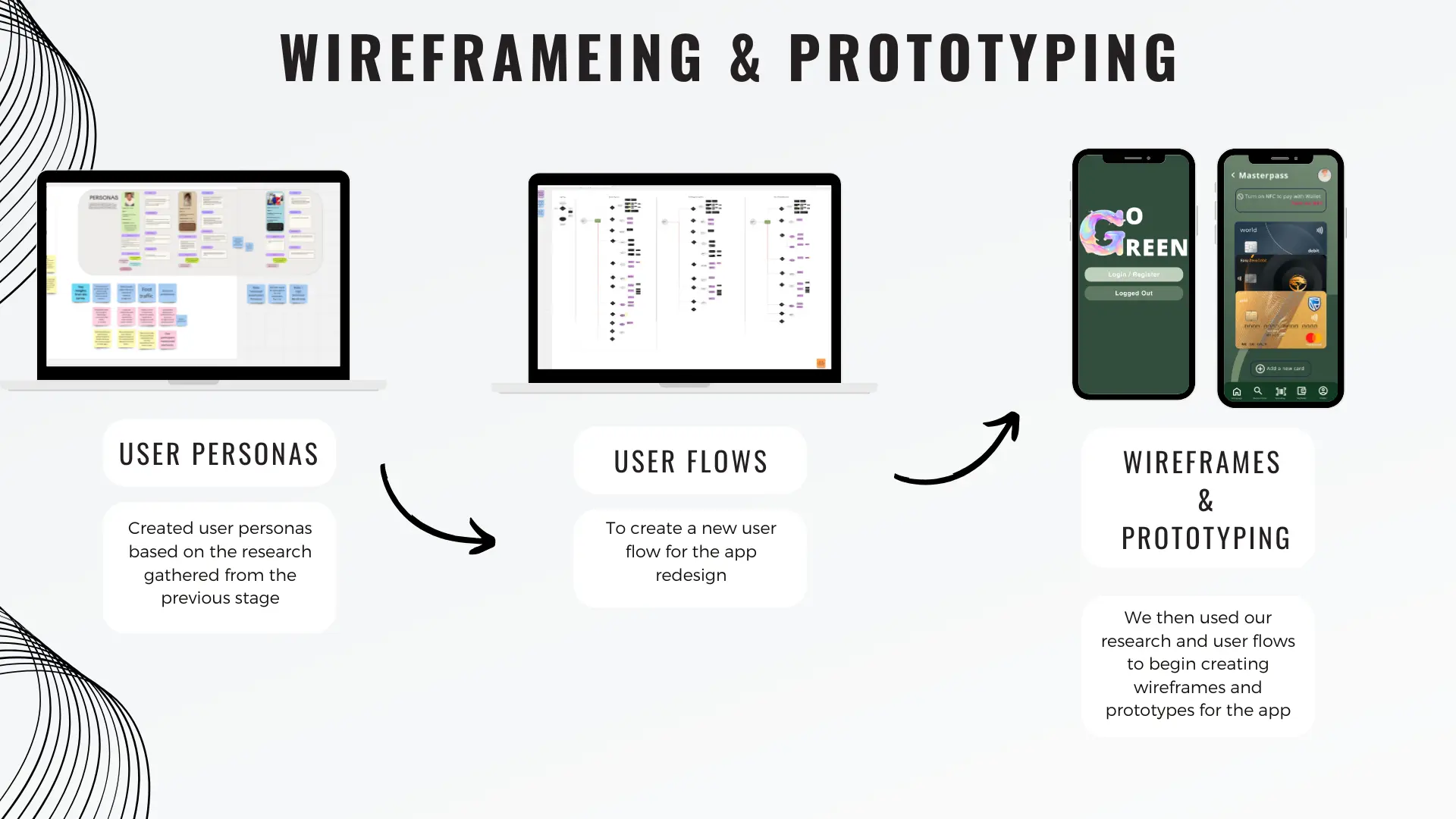
Wireframeing & prototyping
From the findings of the research stage, we began by creating user personas based on the insights gathered. This allowed us to start ideating and exploring concepts that could translate these findings into meaningful features for the app. From there, we focused on key features and developed user flows. This process enabled us to create wireframes and prototypes for the application.
User Testing
After prototyping, we moved on to user testing. Participants were invited to use the prototype in a simulated environment, where I acted either as the facilitator or the observer. I took notes, recorded their actions, and captured video footage of their interactions with the app on their phones, allowing us to analyse how they navigated through the application. I guided participants by asking questions, observing their behaviour, and offering clarification if they became confused or frustrated. We then discussed what they liked, what they disliked, and the pain points they experienced.
Feed Back
After reviewing the videos and taking notes, I synthesised our insights and feedback, and we decided the changes that needed to be made to reach the final design.